Context
L.I.F.E Italia is a start-up producing sensor-embedded clothing
(t-shirts and sports equipment), classified as medical devices.
(t-shirts and sports equipment), classified as medical devices.
The segment users were patients, medical professionals, and athletes.
For the patient segment, the sensor-equipped t-shirt is a revolutionary way to take medical exams, allowing them to stay at home when taking an exam (and thus reduce stress), and not carry around a heavy and impractical external machine.
To operate, control the t-shirts, and provide the visualization of the collected physiological data, L.I.F.E Italia was in need of three complementary Healer products, one targeted to patients the "Patient App" and two others targeted to health care professionals.
My role
As a UX/UI Designer at L.I.F.E Italia, I was responsible for the research, gathering the requirements from the stakeholders, and building prototypes in search of value, usability, while meeting the business needs for the Healer Solution. I worked on this project in collaboration with Marta Aragon Gallardo, in a cross-functional team composed of 3 developers, a Product Manager, and the Lead M.L and Algorithm Engineer.
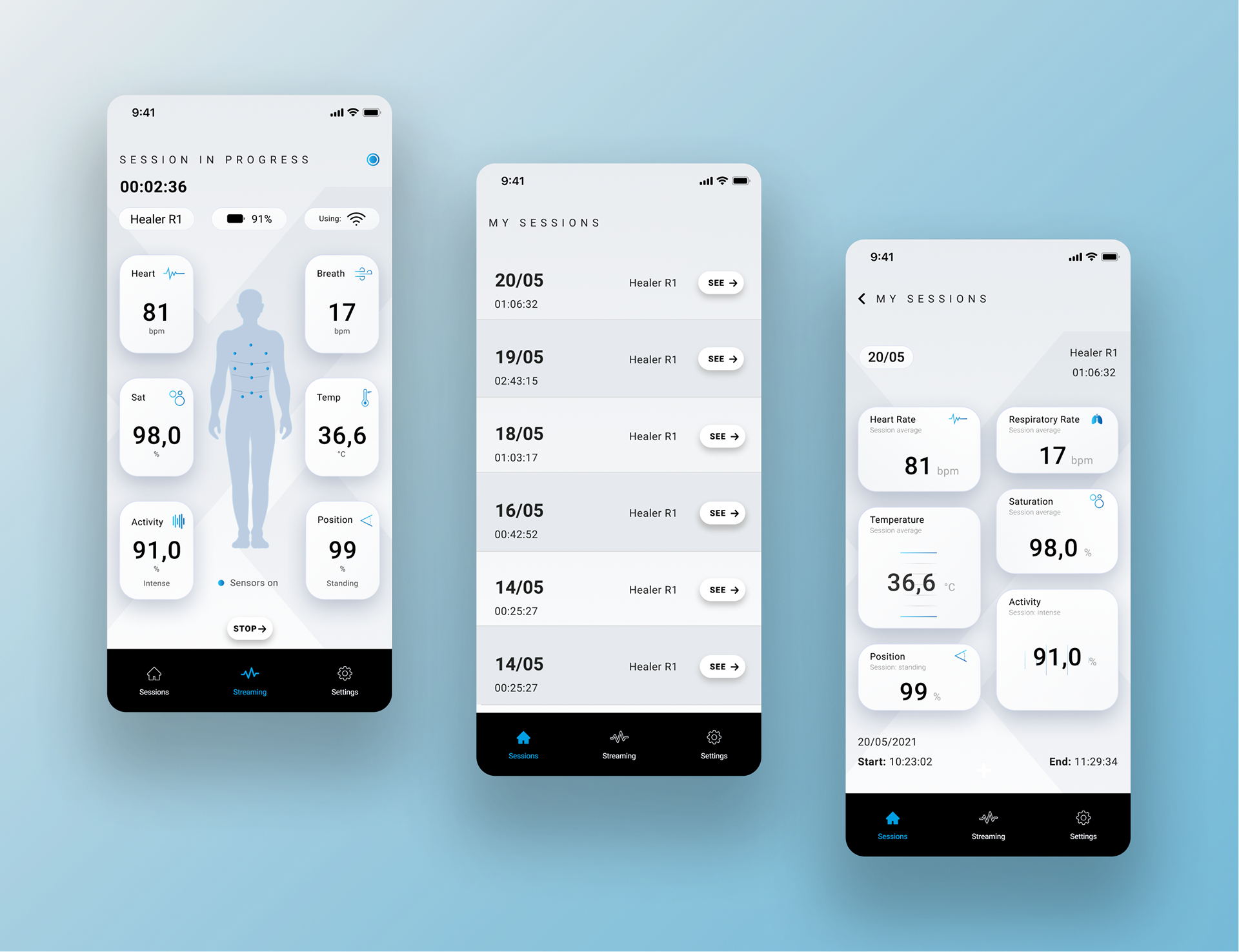
This case study showcases the Patient App, a solution to provide medical data visualization collected by the devices (Heart rate, respiratory rate, saturation, body temperature, position, and activity level) to a non-professional audience. The data is then transmitted to the health care professional, who will be able to establish a diagnosis.
This case study showcases the Patient App, a solution to provide medical data visualization collected by the devices (Heart rate, respiratory rate, saturation, body temperature, position, and activity level) to a non-professional audience. The data is then transmitted to the health care professional, who will be able to establish a diagnosis.
Problem statement
Patients undergo a considerable amount of stress while taking a medical exam at the hospital. They can even suffer from "white coat hypertension", occurring when the blood pressure readings at the hospital, or at the doctor's practice, are higher than they are in the calm of home. It has been proved that the undergone stress during the medical exam can distort medical results.
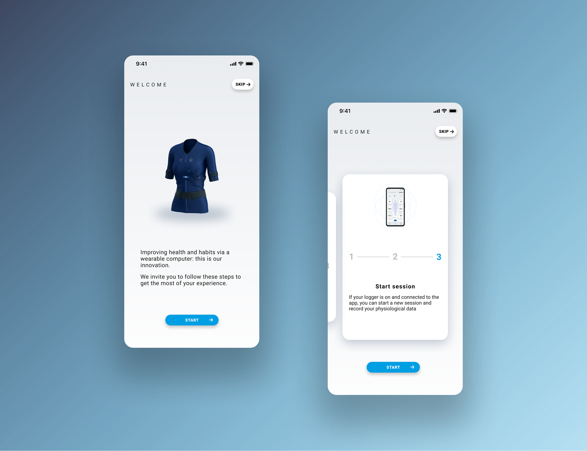
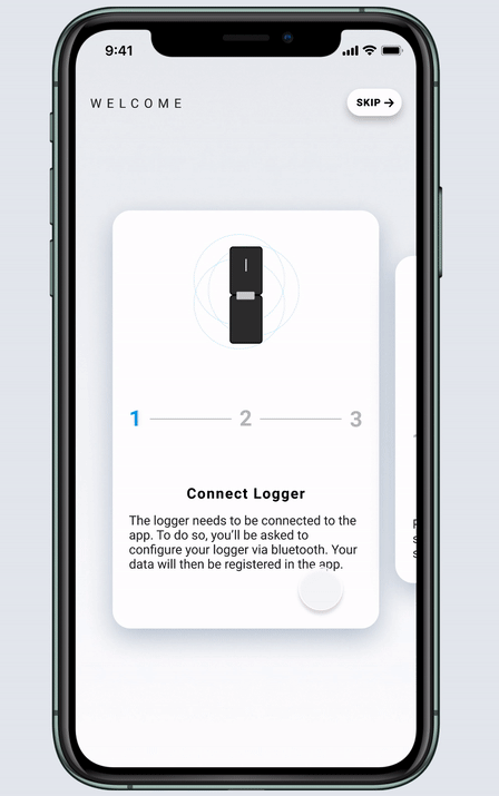
Patient App - Onboarding
Exploration
The main goal of the Mobile App was of course to translate the physiological data acquired via the connected t-shirt to the patients, in a clear and simple way, but our research via discovery interviews also revealed that the patients needed to play an active role in taking their medical exam.
I started by conducting competitive analysis and did additional user research to be able to create user personas to get a better grasp of the solution to provide. I found out that the users were in need of three main elements:
- A sense of trust
- Non-aggressive signals and neutralizing elements preventing fear and stress
- Popularization of scientific concepts and data
- A sense of trust
- Non-aggressive signals and neutralizing elements preventing fear and stress
- Popularization of scientific concepts and data
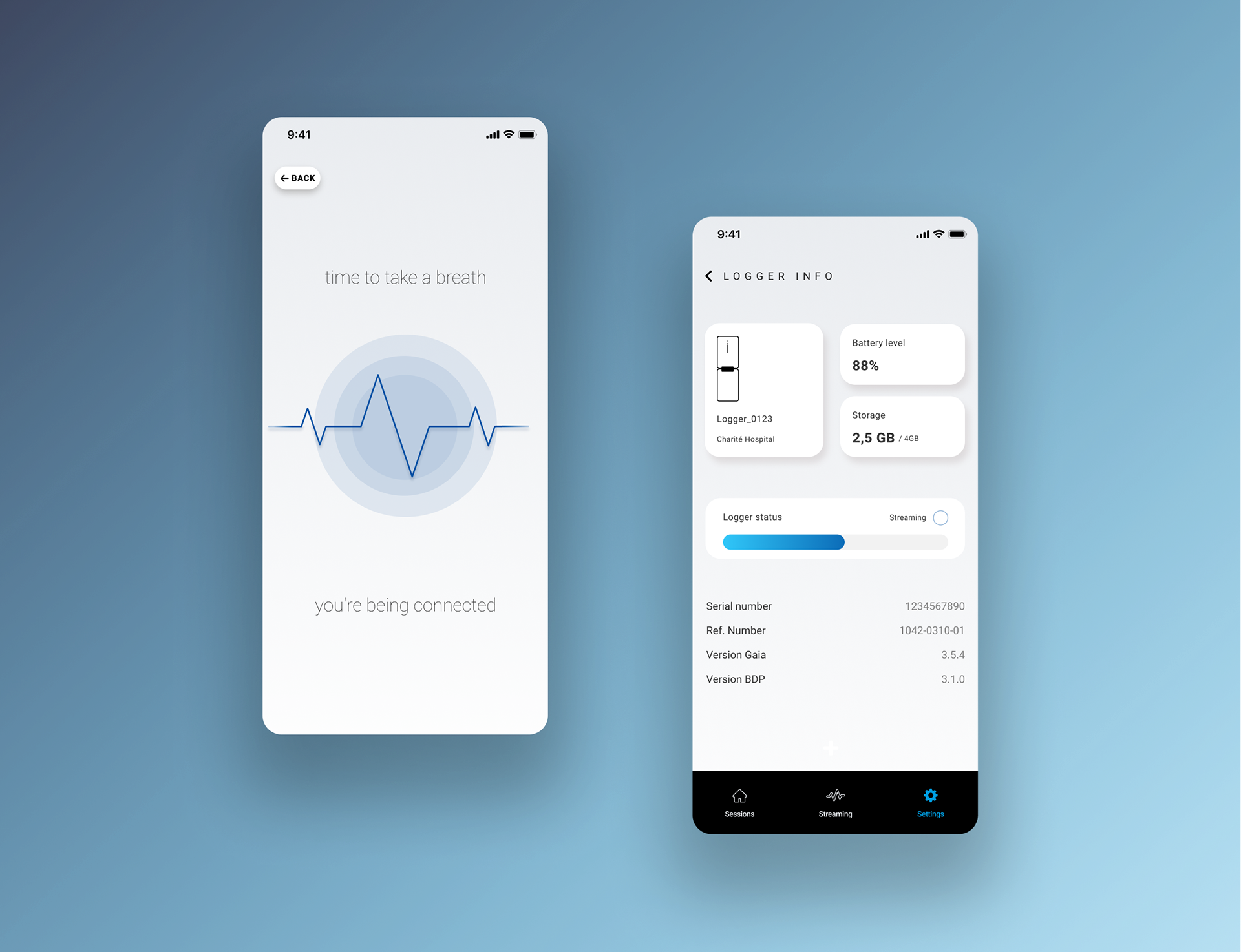
Patient app - Loading screen and Logger info
Refinement
After having worked on a features prioritization and iterated (many times) on the user flows with the product team to take the technical constraints into account, we conceived the first mid-fi wireframes using Figma: see them here.
Those mid-fidelity wireframes provided a great basis to conduct our first tests and to refine our solution towards a much simpler solution.
Solution
Figma was used throughout the design process.
See a prototype for the following job story: As a registered user, I want to start my t-shirt via the app in order to record a session exam.