Context
Life Italia was entering a new phase, marketing its flagship product, a connected t-shirt. As a consequence, the sales team and, more broadly, the whole company needed a showcase, institutional website to present the company and the product to the market and to use this site as a tool to reach market-fit.
The website the company had until then was very basic and sketchy, consisting of 3 pages, and the whole product lacked clarity, no user experience had been taken into account. In addition, there were no analytics tools used to measure user behaviour.
My role
To deliver the complete User Experience and the User Interfaces of the new showcase website in collaboration with my colleague Marta Aragon Gallardo, presenting the company and the products.
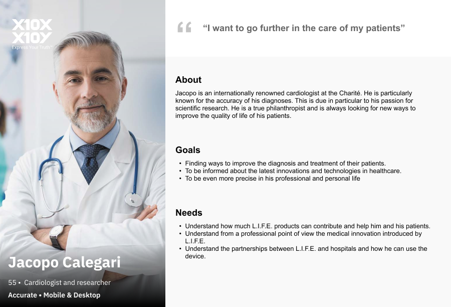
User Persona: Educated doctor
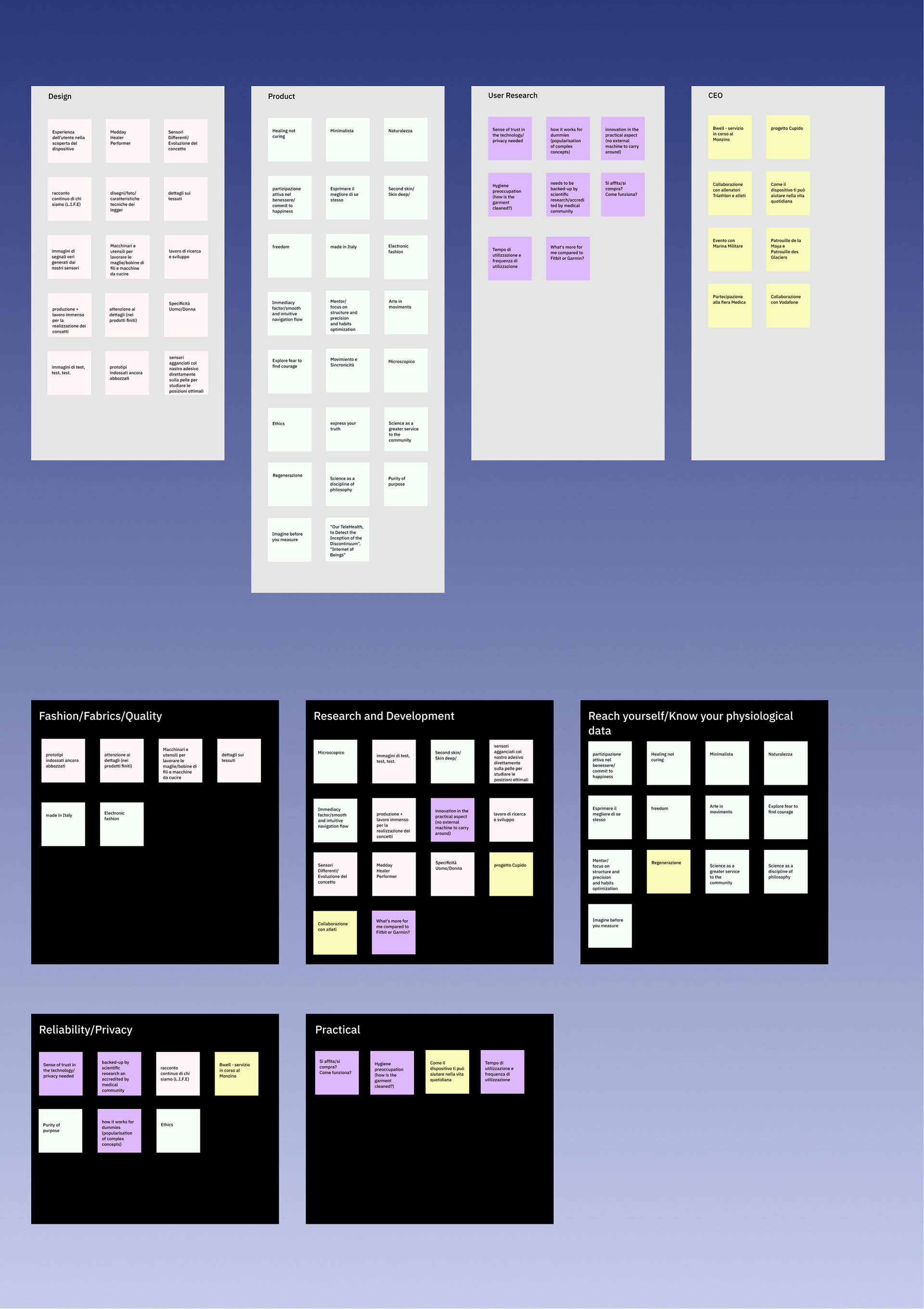
Affinity Diagram
Process: User research and understanding the vision
We first conducted qualitative interviews with the stakeholders: the CEO, of course, the industrial designers, the production and sales team. The first difficulty we encountered was that there was no dedicated marketing and communication team. Therefore we had to start by understanding and putting the vision into words.
In addition, we were working with an outdated brand manual, lacking modernity, no design and colour system had been put in place.
In addition, we were working with an outdated brand manual, lacking modernity, no design and colour system had been put in place.
The insights we obtained were compiled into an affinity diagram. In parallel, we conducted user research and completed it in our affinity diagram.
We also created user personas, to deepen our understanding of our target users. Together with the product team, we created about ten user personas, but we soon realised that we needed to focus on a maximum of 3-4.
We also created user personas, to deepen our understanding of our target users. Together with the product team, we created about ten user personas, but we soon realised that we needed to focus on a maximum of 3-4.
That's when one of Marty Cagan's key principles from his book Inspired came to mind:
"One of the surest paths to product failure is to try to please everyone at once: The product strategy needs to spell out a logical and intentional sequence of target markets for the product teams to focus on. "
Defining focus
Therefore, the challenge we quickly faced was that we had to combine addressing an over-educated target user (doctors for the health segment, trainers for the sports segment), and an "uneducated" audience consisting mainly of patients and technology-savvy users, curious about the innovative product.
That's why we proposed several (8) options for our How might We, and finally decided to focus on one:
How might we communicate why it is vital for users' well-being to know their physiological data and how L.I.F.E. can help them achieve their best?
How might we communicate why it is vital for users' well-being to know their physiological data and how L.I.F.E. can help them achieve their best?
Towards a first solution
We worked on the information architecture, iterating several times on the site map, to understand what the best path would be for our users, and then moved forward with a first version of low fidelity wireframes.
The first hurdle we encountered was that a first version of the site had already been developed on Wordpress, by a web designer, and we were asked to reuse the developed components. This limited our creative process, as we were forced to design with the existing layout elements.
The first hurdle we encountered was that a first version of the site had already been developed on Wordpress, by a web designer, and we were asked to reuse the developed components. This limited our creative process, as we were forced to design with the existing layout elements.
These low-fidelity mock-ups made on paper were first tested with some of our target users (potential patients and associated medical staff) for value and usability. How easy was it for doctors to find the technical information they needed? Was it easy for a sceptical patient to be reassured about the technology and the company?
Once we were assured of the ease of use and value of the site, we created our mid-fi wireframes and included the development team in the process to ensure feasibility. This part was easy because, as mentioned earlier, we were designing existing components, we just had to make sure that new components could be added and that our new site plan could be implemented.
These wireframes also helped us to ensure that our product had sufficient commercial viability. They were presented to stakeholders in this regard.
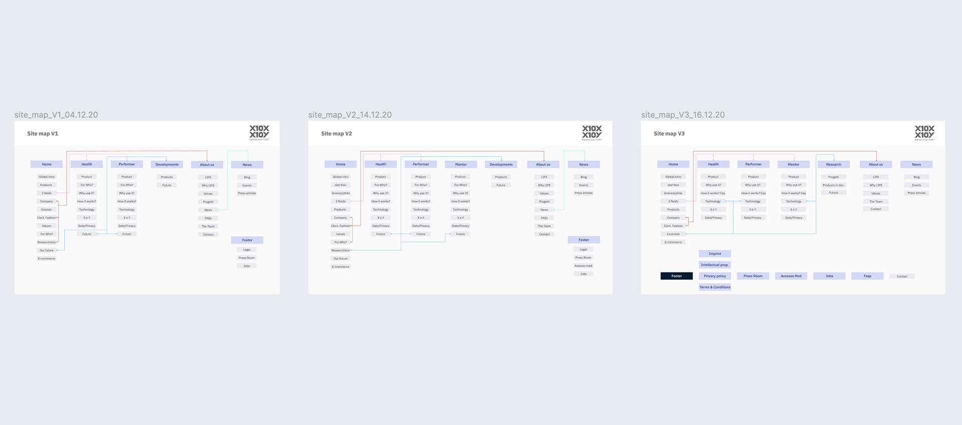
Sitemap iterations
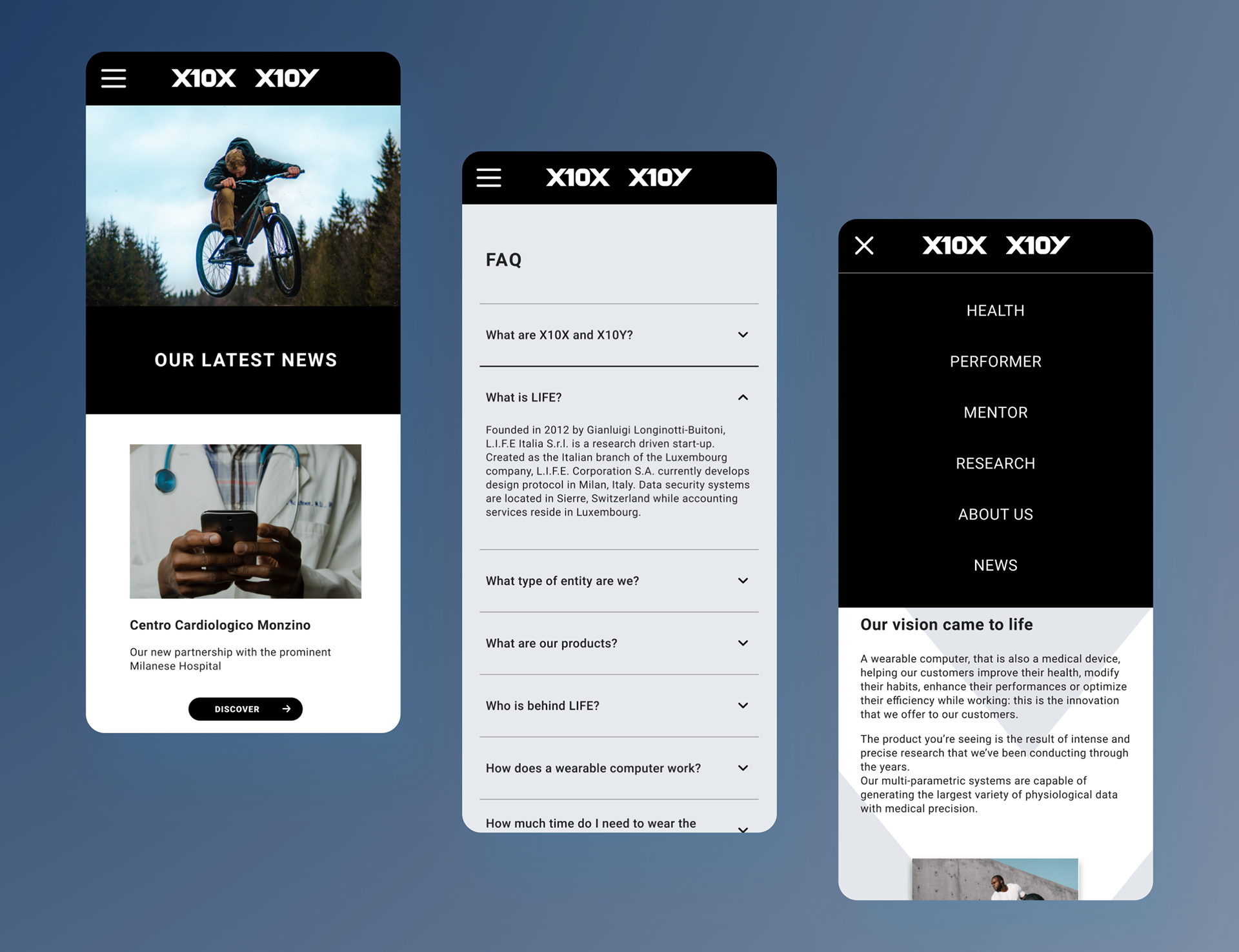
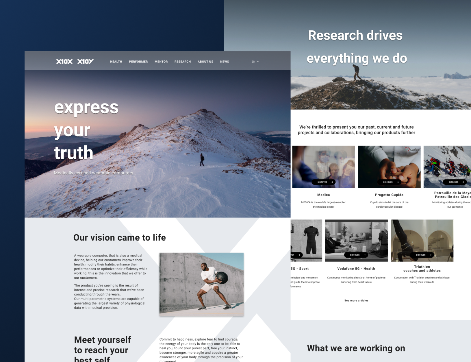
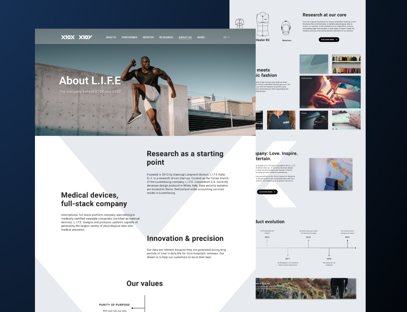
The high-fidelity prototype
We then proceeded to develop high-fidelity screens. Our visual style was defined by our research of purity, nature, well-being, trust, and movement. We could then create our style guide and design system. The prototype was created with Invision and proved to be an excellent tool to check the usability of the product.
Of course, at this stage and with this type of prototype, we couldn't prove that the product would sell. But we could validate the vision encompassed in our How might We and be assured our targets users could get their needs and goals fulfilled.
Of course, at this stage and with this type of prototype, we couldn't prove that the product would sell. But we could validate the vision encompassed in our How might We and be assured our targets users could get their needs and goals fulfilled.
Outcome
Due to a lack of content (text and images), the website could only be launched in August 2021 (www.x10y.com). It is now a great support for the sales team, but the impact on target users could not be measured at the time of writing. I have suggested to the team to use Mixpanel to get better insights into the user behaviour.
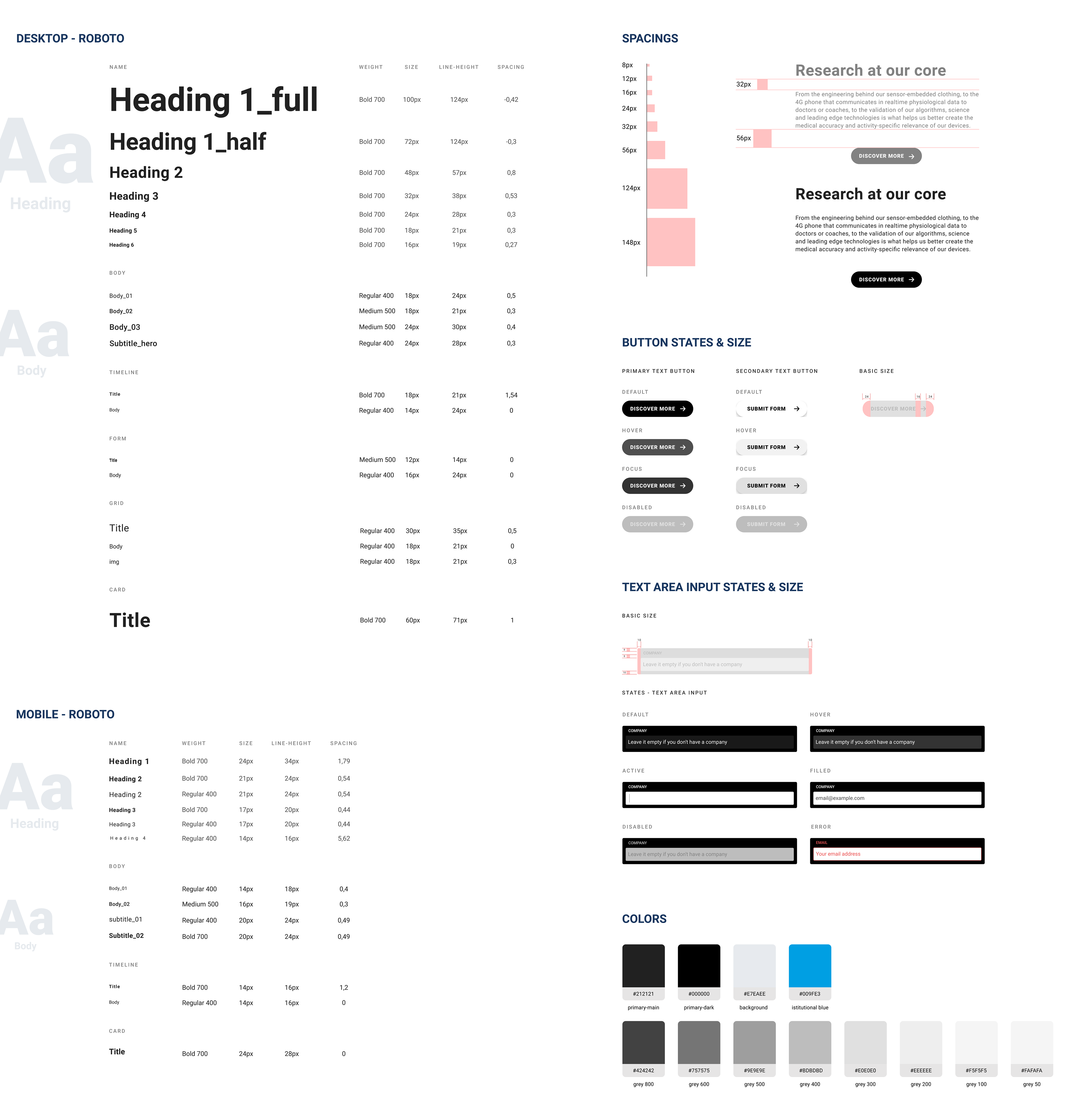
Our style guide